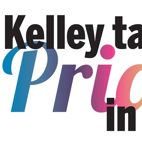
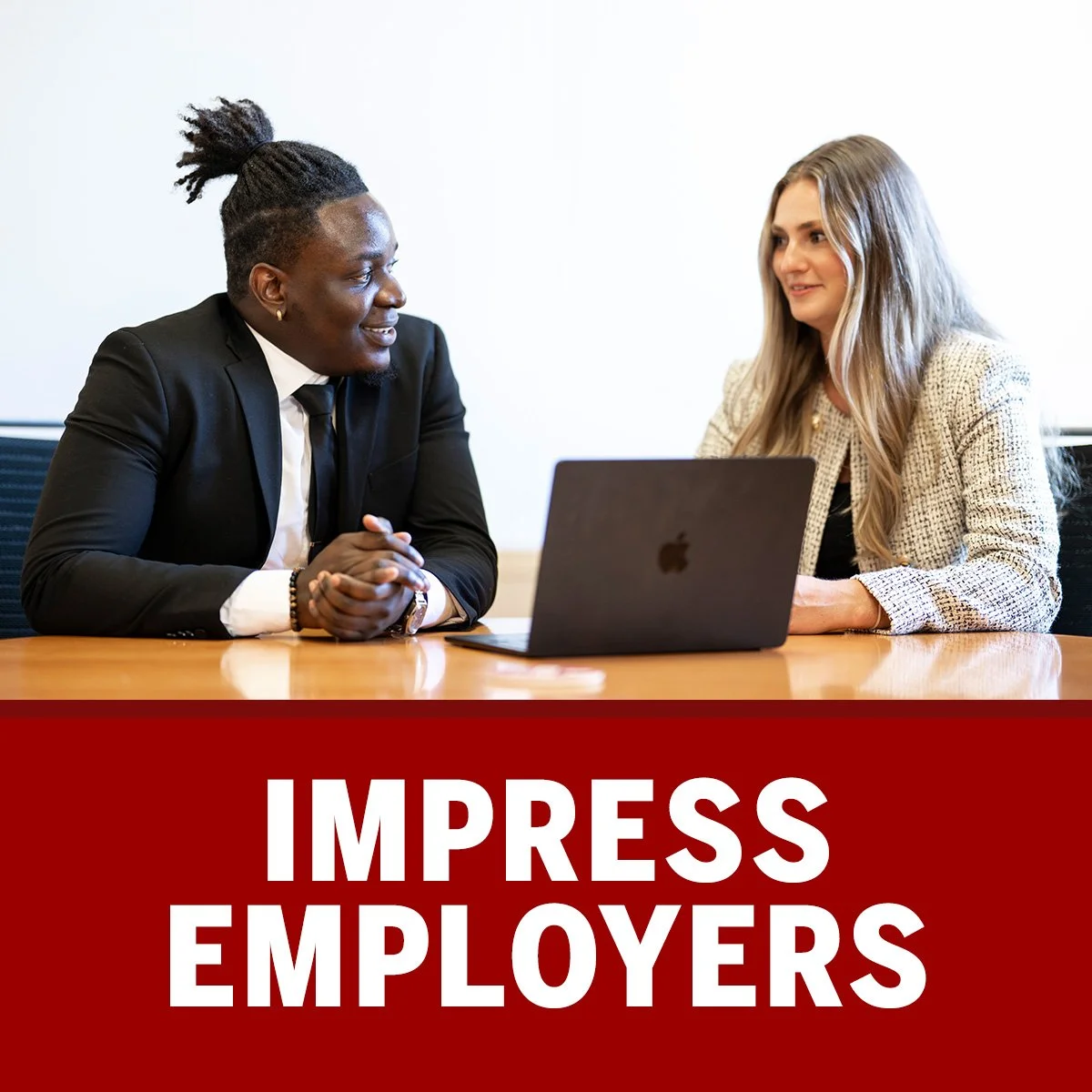
This multi-piece project was created to celebrate and promote Indiana University Kelley School of Business's support of the LGBTQ+ community during Bloomington Indiana's annual Pride Fest. Included in these promotional materials is a booth poster and informational board, a selfie frame, decorative panels for a prize wheel, and a sticker. This promotion was designed to be eye catching, engaging, and memorable. Students and supporters were encouraged to learn about what the Kelley School of Business could offer them and show that they are a safe and inclusive network.
Universities tend to have very strict guidelines for how information is presented. It was a breath of fresh air to produce such colorful and unique work that was so positively received by both the school and the participants at the events. We have also showcased these pieces at Indianapolis Pride as well thanks to the consistent branding all the campuses share.
In the sunny east coast town of Marina California lives the energetic and passionate business owner of The SoxBox, Athena. When she is not weight lifting of firefighting, she is promoting her unique and comfortable sock-ware to the world. I had the privilege of getting to know her on a trip to California and we formed a long lived working relationship.
The SoxBox’s mission was to produce comfortable and stylish socks for the active and hardworking individual. I began to collaborating with Athena on designs she wanted to produce and requests her clients would bring to her for custom items. It was my job to hear her vision and translate it to a two dimensional mockup of what the product would look like. These drafts would then be sent to her printers. I was also tasked with cleaning images from her photo shoots to use as product shots on her website.
Visit The SoxBox https://thesoxbox.com/
For 2 years I have had the privilege of designing pages and advertisements for a local Bloomington Indiana magazine, the Ryder. This publication was a labor of love by a collaboration of freelance writers and designers and featured stories and events happening in the Bloomington area. I was given a lot of creative freedom to choose typography and graphic elements to best showcase the stories, images, and messages I was given by the editors. Each piece was unique and offered the opportunity to experiment with different layouts and use a variety of design tools.
Since the stories were made by a rotating variety of freelancers, we work exclusively remote. I worked with our editors to determine any content and layout issues on the pages. We went through a couple printer changes during my time with Ryder and occasionally had to contact them directly to determine new specifics for page setups they needed.
Overall working with the Ryder was a joy and a great addition to my design history. Getting to see the results of a multi-person project print as one piece is thrilling and I am excited to see what comes next.
*Due to the passing of the Ryder's founding editor, the magazine's production has been put on hold.